Introduction - Welcome to the brand guideline for Kraft™, a modern and minimalist financial company dedicated to providing clarity in financial services. In this document, you will find detailed information about our brand identity, including our mission, vision, brand voice, color palette, typography, and stationery mockups. Our logo, characterized by the letter "k" in a contemporary design, embodies our commitment to simplicity and transparency in all aspects of our business.
Mission - At Kraft™, our mission is to empower individuals and businesses to achieve their financial goals through innovative solutions and clear guidance. We strive to simplify complex financial processes and offer transparent services that instill confidence and trust in our clients.
Vision - Our vision at Kraft™ is to become a leading force in the financial industry by consistently delivering exceptional value and clarity to our clients. We aim to set new standards for transparency and customer-centricity, fostering long-term relationships built on integrity and reliability.
Brand voice - Our brand voice is characterized by clarity, professionalism, and approachability. We communicate with our audience in a straightforward manner, providing clear and concise information while maintaining a friendly and welcoming tone. Whether we're discussing financial products or offering guidance, we strive to make complex concepts understandable and accessible to all.

Color Palette - Our color palette reflects our brand's modernity and clarity:
Primary Color: HEX #ff6700 (Orange) - This vibrant hue represents energy, innovation, and enthusiasm, reflecting our dynamic approach to financial solutions.
Secondary Colors:
HEX #dcdcdc (Light Gray) - This neutral shade conveys professionalism, balance, and sophistication, providing a subtle backdrop for our brand elements.
HEX #dddddd (Light Gray) - Similar to our secondary color, this tone reinforces our brand's commitment to clarity and simplicity.


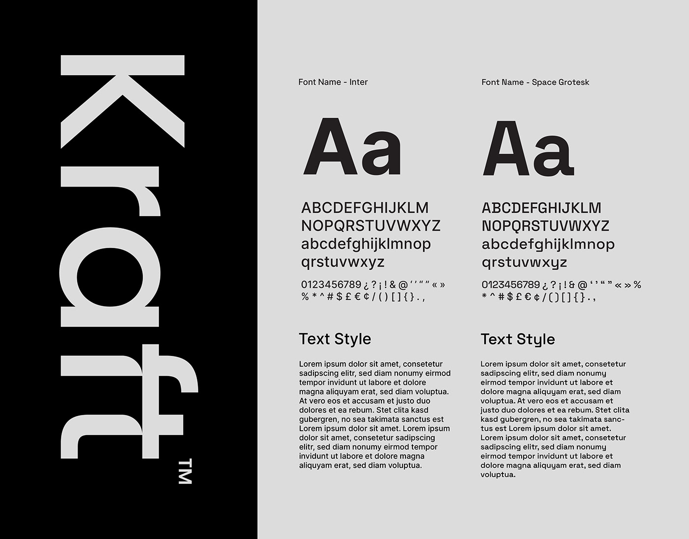
Typography - We use two complementary typefaces to enhance our brand's visual identity:
Primary Typeface: Inter - This versatile and modern sans-serif font is used for headlines, body text, and other prominent elements. Its clean lines and legibility reflect our commitment to clarity and simplicity.
Secondary Typeface: Space Grotesk - This geometric sans-serif font adds a touch of sophistication and uniqueness to our brand. It is primarily used for headings, subheadings, and other design accents, providing visual interest while maintaining readability.
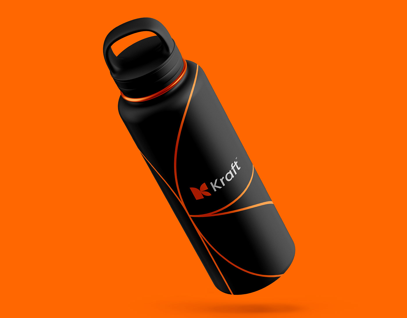
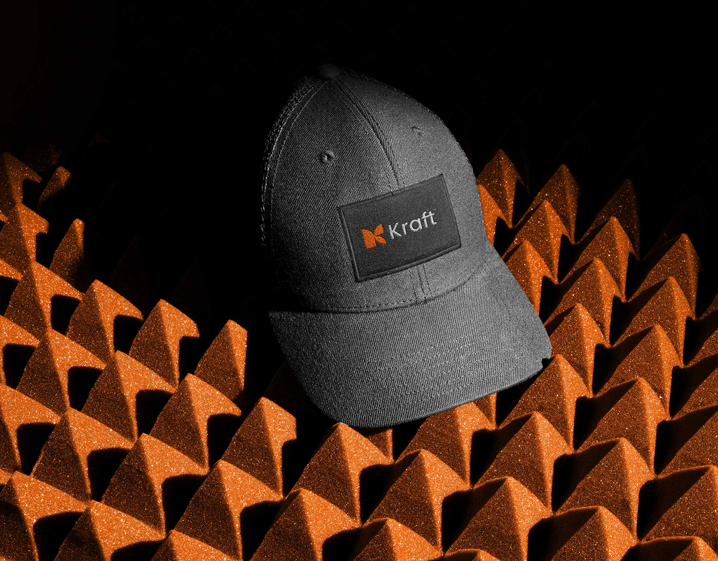
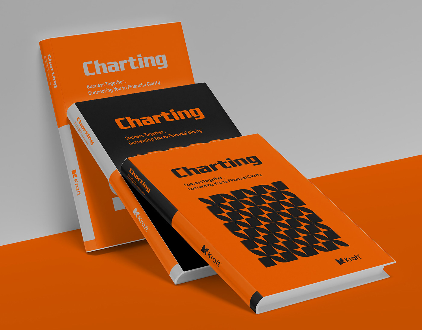
Stationery and Other Mockups
In the accompanying mockups, you will find examples of how our brand elements are applied across various stationery items, including business cards, letterheads, and envelopes. These mockups demonstrate how our logo, color palette, and typography come together to create a cohesive and visually appealing brand identity that resonates with our audience.
By adhering to these brand guidelines, we ensure consistency and coherence in all our communications, reinforcing our commitment to clarity, professionalism, and innovation at Kraft™.